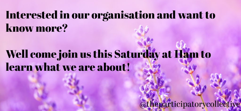
This is a Facebook event page that I designed to let users know that they can attend an in person event run by the participatory collective. I made sure that the colour scheme matched the theme of my web page as to not confuse users because they are both from the same organisation. I also tried to make sure that I kept the tone of voice the same as on my web prototype on all my social media designs.
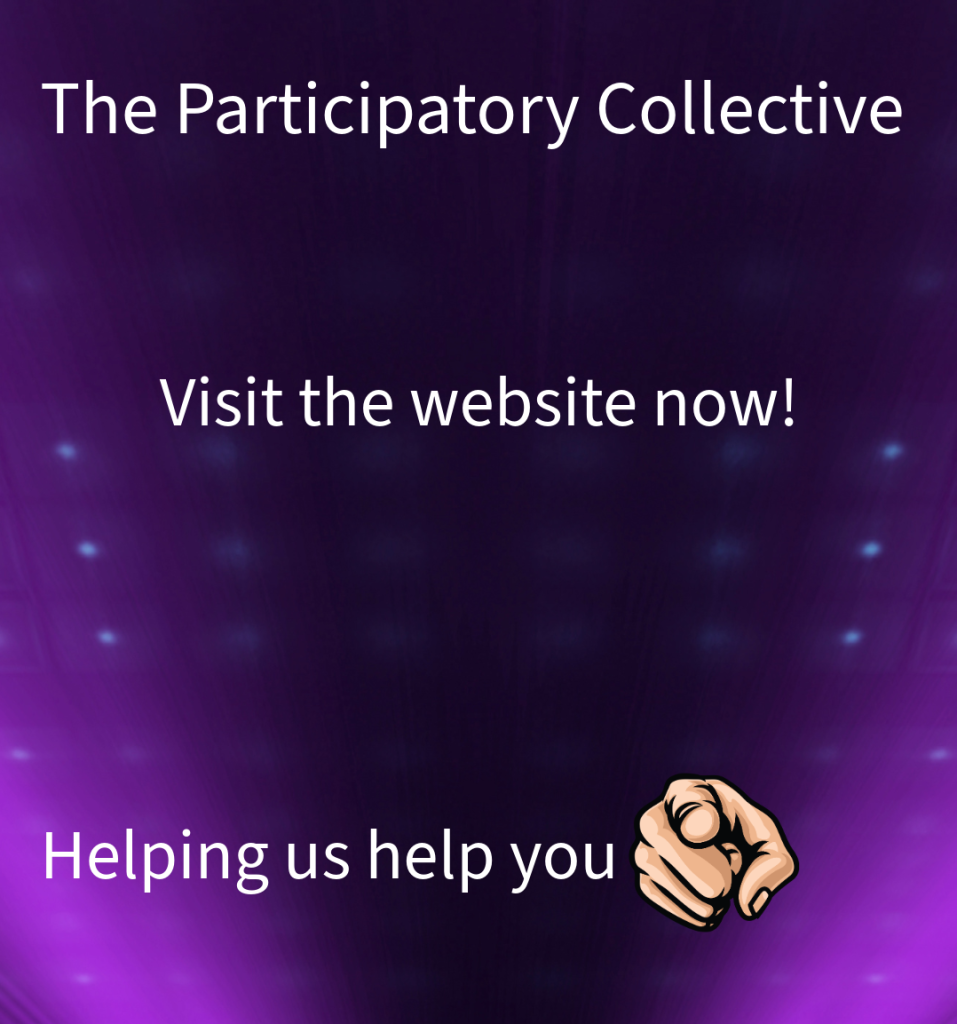
This is an Instagram story that I made to let users know that there is a web page that they can visit and show support on. I also wanted to let the user know that if they help the participatory collective, the participatory collective can help them. I again made the colour scheme match the theme of my web page to keep it consistant and made it accessible for those who may have accessibility needs.
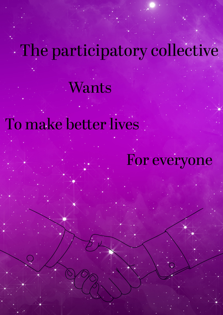
This is another Instagram story that allows users to know that the participatory collective wants to help them live better, fairer lives. I added in two hands that are in a handshake to let the user know that the participatory collective means what they say and that they want the user on board to help them achieve their goals. I also made the colour scheme of this Instagram story match the colour scheme that is on my web page so the user would see a correlation between the two pages and know that they link together.
I designed it this way with the text being split into different sections because it makes the Instagram story stand out and the user will be more interested to read the entire text. I also made sure that it would be accessible to those who have accessibility needs, such as choosing a font that would be easy to read and making sure the colour scheme didn’t clash.