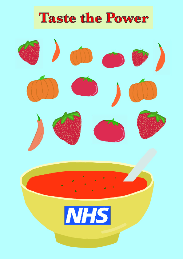
This is the nhs campaign me and my partner made to get 18-24 year olds to eat their five a day. We designed it like this because soup is extremely easy to make and you can use any ingredients you have. It is also a very good way to use up any fruit and vegetables that are about to go bad. Its also very cost effective, as you can make a huge batch of soup and save it for another day.
We felt like this would be best because our main target audience is university students and young adults who don’t have time to cook/don’t know how to eat healthy. If a single student/person was to buy some fruit and veg, they probably wouldn’t eat it all before it goes bad, so to save some money and stop wasting food, we made a campaign to solve this problem.
I ended up re-designing the first campaign we made as it didn’t really catch what we were going for. We wanted to fruit/veg to look as if they were falling into a bowl of soup and our original design didn’t capture this is the way we hoped. Our re-design actually achieves our goal. I also ended up moving the nhs logo to the bottom corner instead of being on the bowl as there was a lot of empty space which made our campaign look small and un-effective. I also changed the font and the font colour to promote our stratline more effectively and to give it more meaning. I also included some steam to make the soup look hot, fresh, and appealing to our viewers.

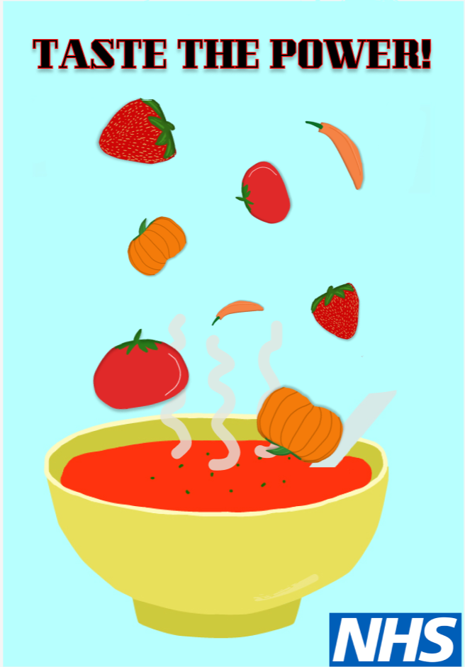
I also made this moving image (gif) to promote our campaign. I still made it a bowl of soup with falling fruit and veg so our viewers know that we designed both the campaign and the gif with no confusion. I tried to make the gif and similar to the campaign as i could so it would be more effective and pleasing to look at.
We chose this colour scheme to make our campaign and moving image look fresh and new, but also match the colours of the nhs logo. The colours are pleasing to look at as they are soft colours and don’t hurt to look at. We also thought about people with accessibilty needs, we ensured that none of the colours clashed, that the font would be easy to read, and chose distinctive shapes so everyone can clearly see what we were trying to do.
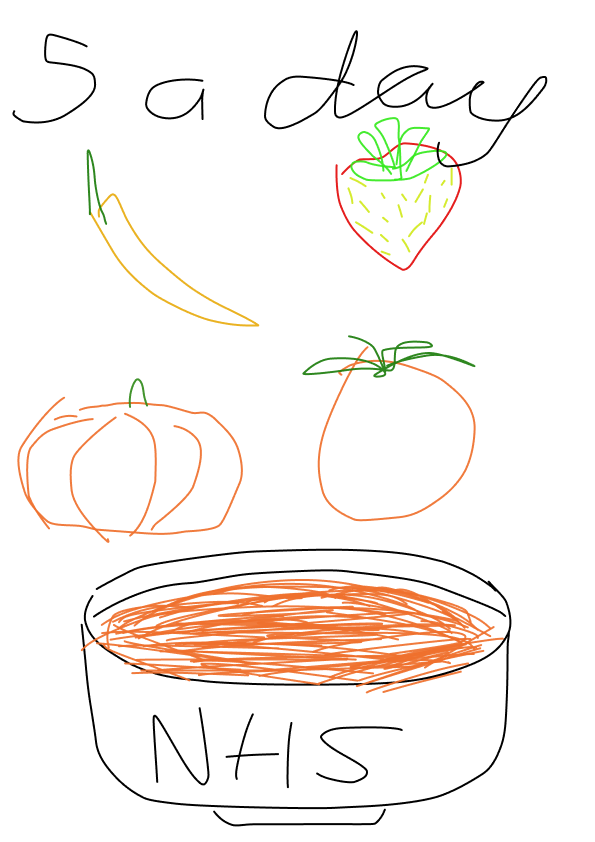
This was our first sketch of our idea. We really liked this so we designed a more effective campaign to make it look like it does now. The only thing we did differently was change the stratline, and some more fruits/veg with different sizes, and change the colour scheme slightly.