I followed up on some feedback I got for this from some of my peers and improved this early low-fidelity prototype into the mid-fidelity prototype it now is. I changed the layout as this didn’t fit all the information and designs I wanted to include. I also changed the colour scheme as this was too dark and would make people with accessibility needs struggle.
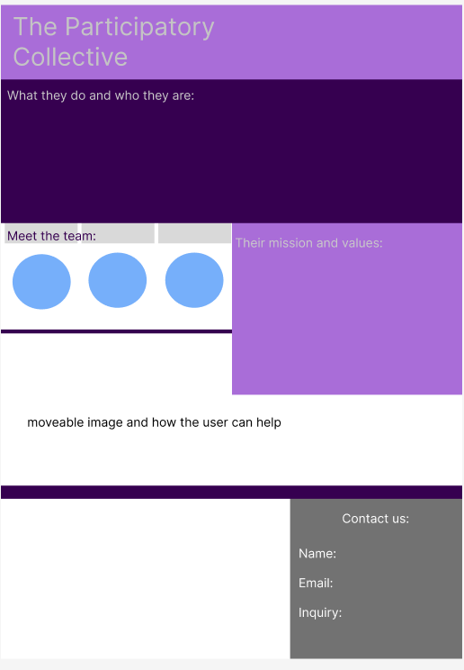
I also changed this based on the verbal feedback that I got given. The colour scheme is all over the place and there is stuff everywhere, making the page hard to navigate. People with accessibility needs would struggle to understand this webpage. I made my actual webpage simpler by only using 5 colours, but using shades of those colours so that they would contrast. I also split the text up so it wasn’t a full block of text. I also changed how people would be able to contact the participatory collective. I added a submit button so they the user could actually submit their questions/inquiries. I added personas instead of a blue circle for the meet the team section of the website.
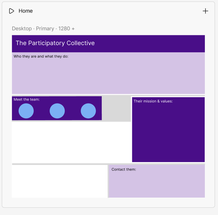
Based on verbal feedback that I got on this, the purple shades clashed with the blue on the meet the team section, there is a random line near the bottom of the page and a random grey box in the middle. This would confuse anyone, let alone people with accessibility needs. I changed all that in my mid-fidelity prototype so it would be suited to everyone. I kept the purple but used different shades so that they wouldn’t clash with anything, I made the layout better than it was and made the navigation so much easier to find/use.