My figma file – Mid-fidelity Prototype – Figma
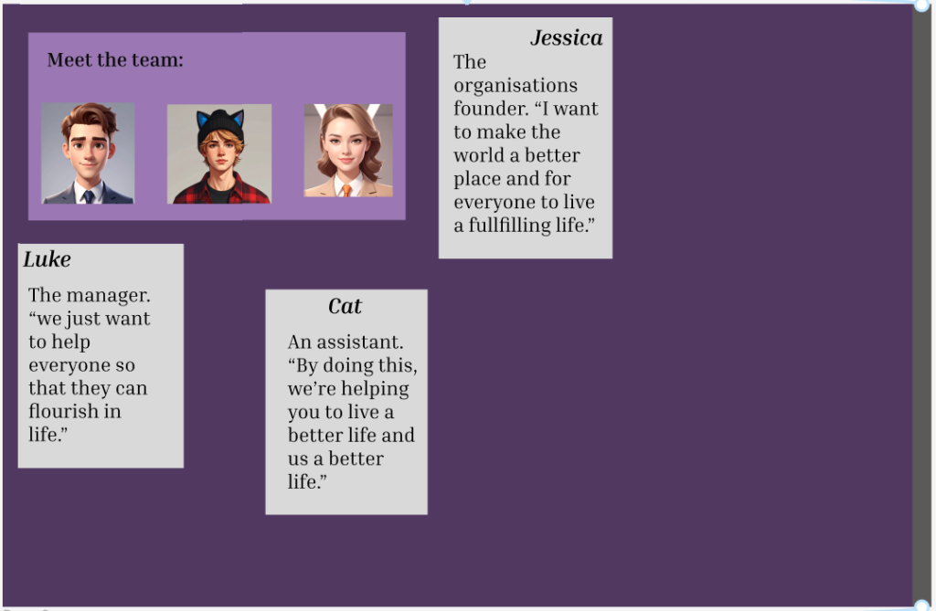
This is the first page after my home page. I decided to add some members of the participatory collective so that the user can see who’s actually behind the project instead of being left in the unknown and they are more likely to donate/join the mailing list. I added some quotes of what they want from the project to make it seem more real.
I again used different shades of purple so the user would stay interested in the website.
The floating text boxes are actually going to be a hover function in the final version of the website. When the user navigates to the page using the scroll function, the will see only the team members, not the text boxes. But if the user hovers over the team members, the text will be revealed. The page may seem empty at first but that is intentional.
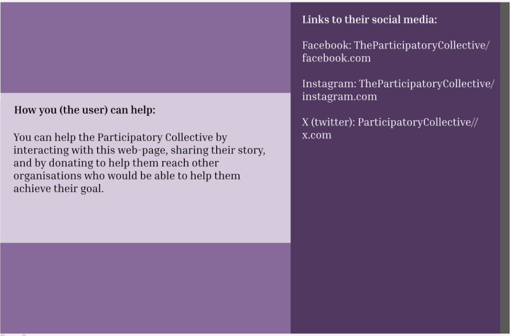
This is my second page. I included information about how the user can help, so if they wanted to help, they can and I included some social media links to the participatory collective so that the user can learn more about them and follow their story.
To get to the next page, the user will have to scroll up/down on the grey bar on the very far right of the page. All my pages function like this.
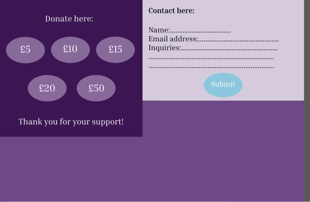
This is my last page. I included a donate area the if the user wanted to, they can donate to the participatory collective to help them with their mission and I also included a contact box so that if the user had any questions or concerns they can write them here and submit it using the submit button. If they add their name and address, they will receive a response back. I also did add a mailing list so that users can sign up if they want to or if they want to help with the participatory collectives mission.