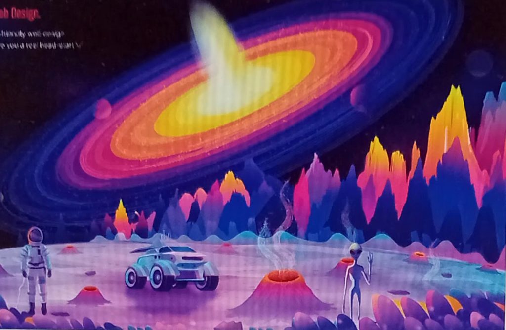
Figure 1: https://dribbble.com/shots/23948842-Header-illustration (N.D) (Accessed 24/10/24)
This is a good example of composition because the black hole is at an angle where you can see it best. You can see most of it, and see clearly how many colours and rings it has. The mountains in the distance are interesting because they are bigger at first, as if they are really close, and then descend into smaller mountains as if they are getting further away, which is very cool to look at. If you look carefully at the planet, you can see that it is curved, which highlights what planets in really life do.
The craters/geysers on the planet seem quite realistic because they match the curve of the planet and have a lot of detail. It does the same thing with the space buggy/vehicle. It has been created to go along with the curve of the planet and the shading the creator has done proves that.
Altogether, this makes me want to learn about space because the image looks very cool, there is a lot of detail, and there is a lot of space related objects/colours that interest me. Also there may be objects in the image that again not many people know about and want to learn about. The colours used are also very cool to look at, they are interesting and bright and make the image fun.
The angle of where everything is in the image makes sense and it makes the image look perfect, and like I’m actually there, which makes it exciting and makes me want to know more.
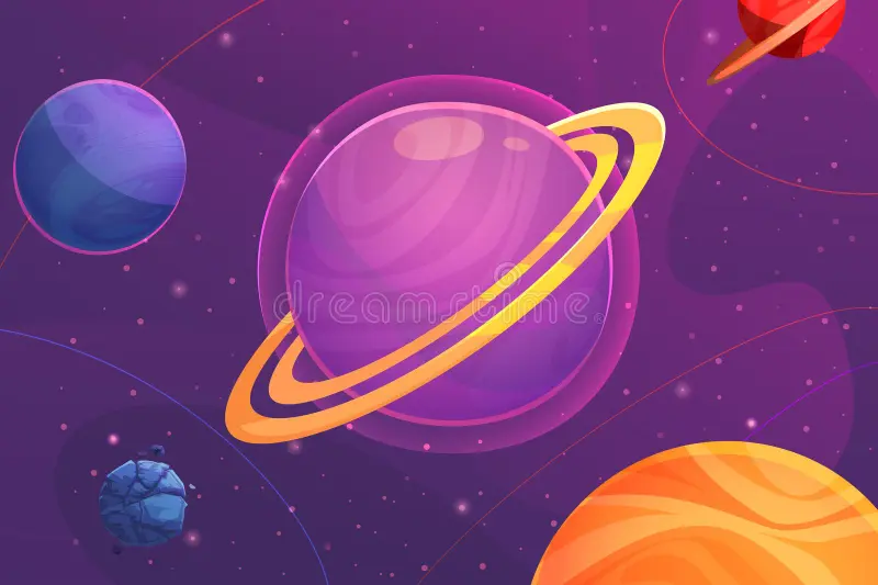
Figure 2: https://www.dreamstime.com/illustration/planets-composition.html (N.D) (Accessed 24/10/24)
However, this example of composition isn’t the best because it is literally an image of some planets that have been tilted. It doesn’t show what composition is, or capture what space is like at all.
The image doesn’t excite me or make me want to learn about space. It is boring to look at, there is nothing going on, it just doesn’t really make sense. Its not realistic, and the background is too dark. The colours don’t really go together and make the image look bad.
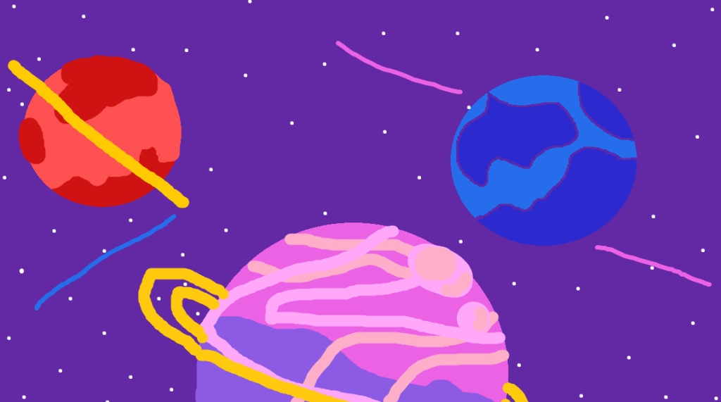
Using Microsoft Paint, I re-designed the image to make it zoom in a bit and to give the image from the pink planets kind of perspective. I did this because it gives a better view on the angle of the image and in my opinion, looks better. I also rotated the image 180 degrees so now you can see the planets better.
I zoomed the image in because I think it is more interesting and it makes it look different from the original image. This gives me a better idea on what planets in space look like so I find it interesting. I kept the colour palette relatively the same as the original image because again, these colours are regularly seen in space, so it pulls the image together.
The angles in my re-designed image makes it feel more real because most planets are tilted on there left side, therefore using realism makes it more exciting.