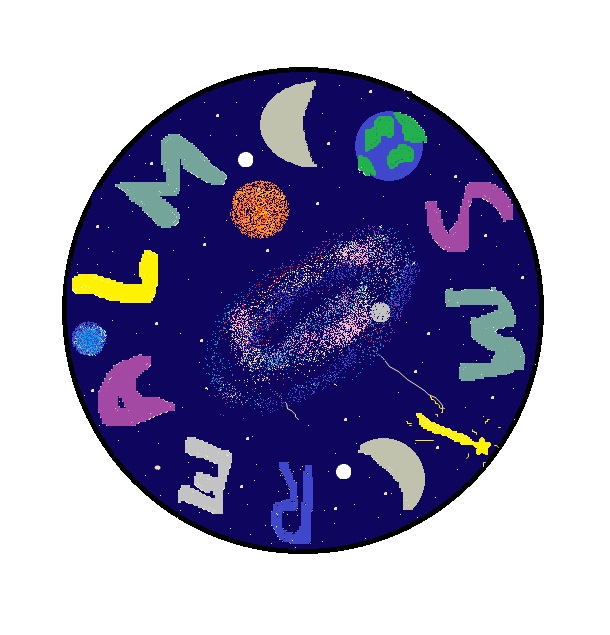
For my logo design, I started by deciding on what shape I wanted it to be, I chose circle as it fit the design the best. I wanted to make the letters of ‘Cosmic Realm’ look like they were part of the circle so I put them out the outer edge and separated the two words with a white dot. I drew the letters by hand as I wanted a rustic look and it meant I could do anything I wanted. I made the letters many different colours because I wanted it to stand out and to use colours that linked with space. I made some of the letters into space related objects because 1, its conceptual and 2, it makes the design look cool.
For the background, I wanted to make it out galaxy as that it the main theme of my project. I started with making the main background colour midnight blue and added stars. I then used an airbrush tool to create the galaxy and some planets. This was the best tool to use as all the other brushes were too opaque and blocky. It also made the colours easier to blend.
Overall, I made this design as it fits really well with my theme, all the tools I used worked well with each other, my logo stands out as it is colourful and not something you’d see in other logos.