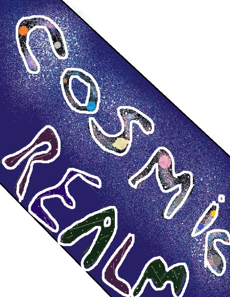
For my typographical standard, I wanted to incorporate everything I have already talked about, planets, stars, and galaxies. I hand drew each letter as I wanted to use a bubble font to add detail into each letter. I made the background of each letter in ‘cosmic’ black to contrast with the blue outer background. I then filled in the letters with planets, dust clouds and stars which I did by using the airbrush tool. After they were filled, I outlined each letter in white to make them stand out more and to also make them look funky.
For ‘realm’ I wanted to keep it basic as a lot went into the first word. I made the dark colours and filled them with stars/shooting stars as I wanted some kind of detail, and just outlined them again in white.
For the actual background, I used a dark blue to contrast with the dust cloud/star kind of thing I made using the airbrush tool. I think putting the word ‘cosmic’ over it worked out really well and it looks cool. I also tilted it to the right because nothing in space is flat/straight, everything is pretty much on a tilt so I thought I would do that with my typographic standard, just to relate it to space a bit more.
Again, I didn’t want to add too much detail as my audience is children and I didn’t want to overwhelm the page.