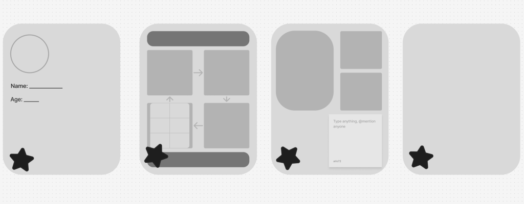
This is the first design I made for my mobile application. My colour scheme was light grey, dark grey, and black because I was creating a pop-punk music star and it worked well even though it looks simple and basic. I only created 4 pages in my first design because I didn’t know what I wanted my person to be about at that point so I didn’t want to add details just to completely change it later.
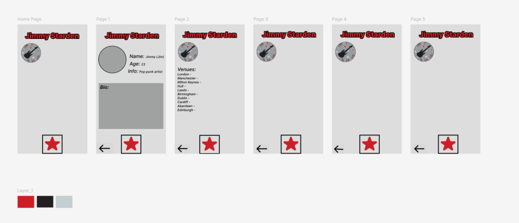
This was my second design, I added red into the colour scheme to make it pop and make the application more exciting and less basic. I really liked this in the end and chose to go with this colour scheme for my end product.
I designed a logo for my pop-punk artist by incorporating an electric guitar surrounded with stars in the colour I chose While this looks basic, I feel like it works really well. I also added his name at the top of each page as an extra logo. I also made star buttons at the bottom of each page as his last name begins with star. I also added back buttons for each page except the home page as that obviously didn’t need one.
I Included locations of each place my pop-punk artist was performing and a bio to let the user know a bit about him and what he looks like to get them interested. My intended audience is 18-26 year olds, though anyone of any age can be interested in my artist/his music.