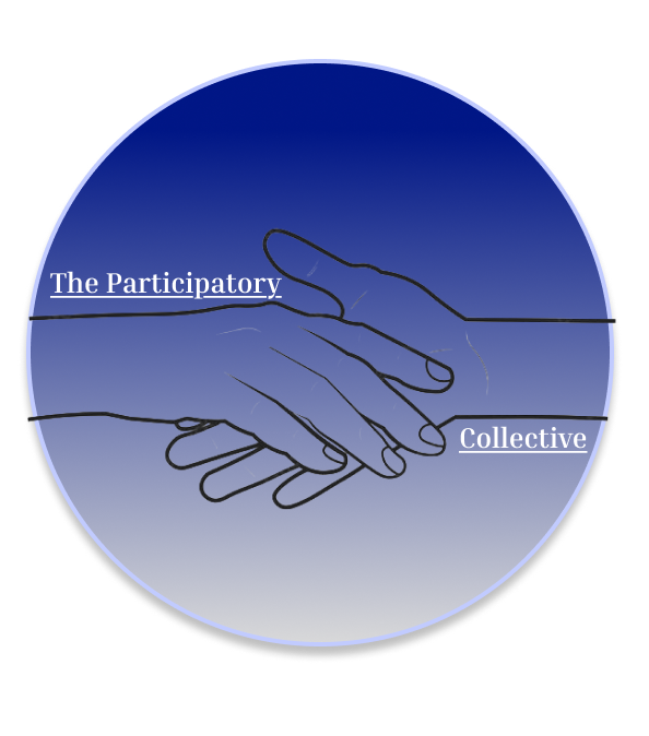
This is the logo that I designed for the participatory collective. As the participatory collective is about wanting to help people and being able to let everyone live fullfilling lives, I decided to add two hands in the middle of the logo, reaching out to each other and holding on, like one person is pulling another person away from an unfair society and allowing them to join them in a happier life.
I used the colours blue and grey for the logo, in a gradient, because it matches the theme of my web page and blue is one of the colours that colourblind people see the most so I also made it accessible. I also think it fits the meaning behind the participatory collective because the colour blue symbolises trust, seriousness, calmness and wisdom.
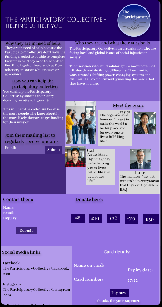
For my web page, the colour theme I chose was shades of purple, grey, black, and white. I chose these specific colours because the colour purple represents a lot of the participatory collectives’ values, and the more neutral colours make it stand out more. I used multiple shades of purple and not just 1 because different shades of purple represent different values.
The font I chose for the web page was abhaya libre semibold, because it looks elegant and that I’m serious about helping the participatory collective. It’s also not overly complicated to read so that users with accessibility needs can read the web page as intended.
This is what my web page would look like if it was opened on a mobile device. The scroll feature is pretty much non-existant and the “submit” buttons have moved slightly. All the interactive features work the same as they do if the web page was being viewed on desktop/pc.
The logo has also changed, with the hands being lower down and the word “collective” being removed altogether. This is because the original design was too large for the mobile page so had to be creative.