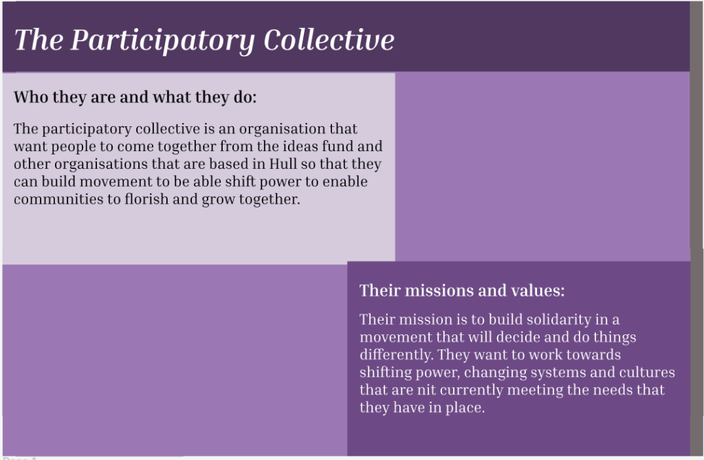
For my homepage, I decided to jump straight into the participatory collectives missions and values, and who they are and what they are trying to do to hopefully get the users attention. I let the user know who the participatory collective are, a little about what they do, what their missions are and what values they have. I split this between two boxes because reading a large chunk of text is hard for some people to read.
I used darker and lighter shades of purple for this project, as it should help people with accessibility needs and the colour purple symbolises a lot, including power, ambition, and peace, which I felt would go with the participatory collective. For the font, I went with Inria serif as it is easy to read but still has a little bit of elegance to it. I made the title italic to make it stand out and too make it not look as basic.
I split the page this way so the user wouldn’t get bored of just a slate of colour and that it would keep them interested in the website. It also helps people who may have accessibly needs as its not just one block of text. I also thought alternating the colours would make the website look fun and stand out a little bit more.
They key pages I included was their story and mission, some of the people involved, how the user can help, and a donate, mailing list, and contact page. I chose these to be the key pages because its important to the user that they clearly know what the participatory is about, and if they want to know how to help/get involved, they can.
For navigation, I wanted to keep it simple so I made a scroll function on the right-hand side of the page so that the user can navigate through each page easily, just like nearly every other website. This helps people with accessibility needs as they should already know where the scroll function is if they’ve used a website before.