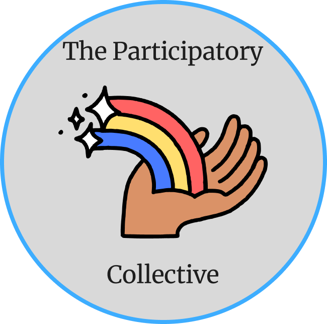
This is the first logo idea I had. I wanted it to represent love, peace, and hope as the participatory collectives’ mission is to bring everyone together to create better lives. I thought choosing a hand with a rainbow was the best way to represent this.
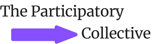
This is the second logo I designed. I made it more simple than the first one as I wanted to explore with different types of logos because I didn’t know which type would fit the organisation.
I had 2 colour schemes in mind. One more heavily focused on shades of purple and the other being mostly focused on different shades of blue.
Colour Scheme 1:
#7349CE
#7D3EA1
#91CEFB
#B3B3B3
#FFFFFF
Colour Scheme 2:
#3DADFF
#3961C6
#1E1E1E
#FFFFFF
#7850F3
I wanted to put the organisation name in the logo so that the user would know what they are looking at and to also give the organisation recognition. I used the font Bookish for the organisation name because its easy to read, the letters don’t clash together which will help people with accessibility needs.