Layout:
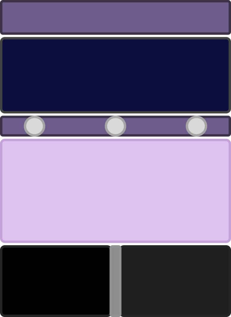
This is one of the layouts I decided on to use for the website. The box at the top is for the title/header, next box is for a video with text over the video, the next box is for stakeholder/employee profiles, the next box is for text containing information about the organisation, and the last boxes at the bottom are for images with text overlapping them.
I went with a purple, black and grey colour scheme, alternating darker and lighter shades for the users with accessibility needs. Purple in one of the colours that most colourblind people can see, hence my decision is choosing it, I also think it fits the theme of the organisation as it represents creativity, wisdom, ambition, love and peace.
For the font, I was going to go with Bookish, size 18/20, with the text colour being white on the darker background shades and black text on the lighter background shades, as to keep my design clear, readable, and easy to navigate.
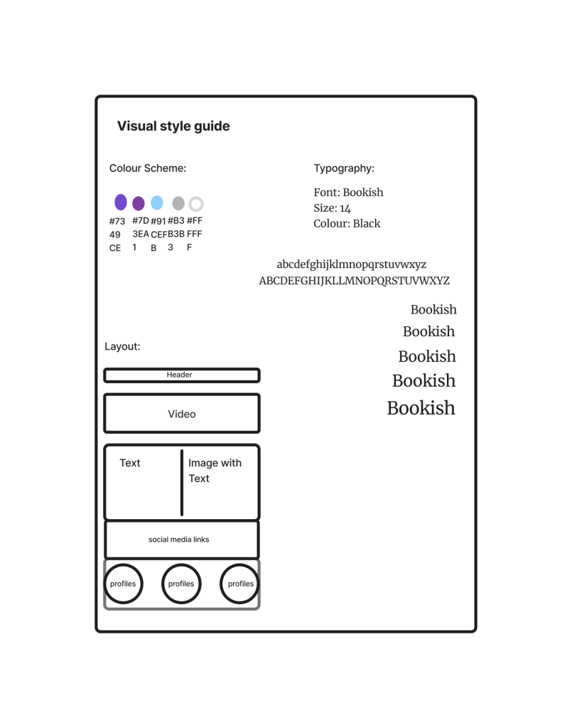
I made a visual style guide to plan out my website design with typography choices, colour scheme, and a layout idea. I did this to see how my website would look before creating the high fidelity version to ensure that all my choices worked together. I tried different sizes of my chosen font so that I would be able to see what works together and what sizes I wanted for my design.
Figma board: https://www.figma.com/board/CtNNhJm0q3EYOULv8xjrRS/Untitled?node-id=0-1&p=f&t=XYNTGKdEo05c3Gv4-0