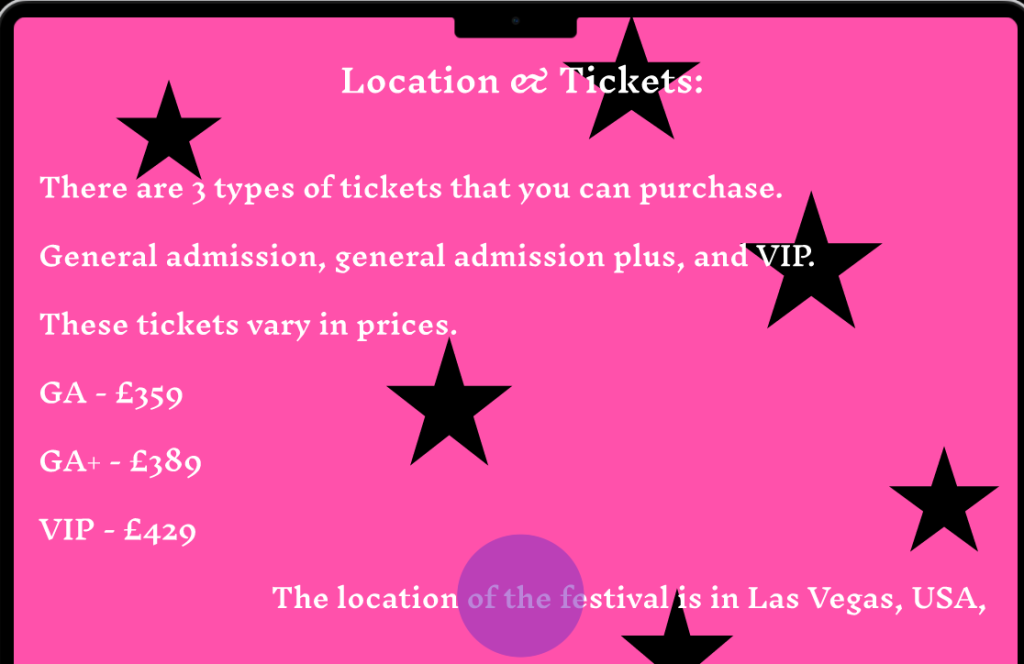
This was one of my rejected designs. I didn’t end up using this because the location of the festival went through the button at the bottom of the page. The ticket prices are also wrong and I didn’t clarify the meanings behind the tickets.
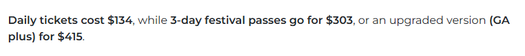
These are the actual prices for the tickets.
Before making my current prototype, i made paper versions of what i wanted my website and mobile companion app to look like and how they would work. I didn’t end up using these however because they didn’t match with the festival theme and the info on them was incorrect and the font was difficult to read. Users with accessibility needs wouldn’t have been able to navigate through the website or app as I made it too complicated and hard to read. My paper version also only had 4 pages altogether, which wasn’t enough.