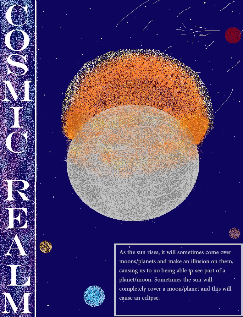
For my first poster I wanted to make it about the sun, so I included a sun coming over a planet/moon as that is what the sun does. I included a small amount of text to inform my audience about how eclipses happen. For the title, I wanted to put it somewhere where it wasn’t in the way but also stands out at the same time. So, I put it on the left side of the poster, the letters stacked onto of each other. The font I chose was Engravers MT as I felt this was the best font to go with my space theme. Its big, its bold and it stands out. For the background of the title I wanted to include dust clouds, which I achieved using an airbrush tool.
I wanted to keep the design simple yet look good as my audience is children, so I added a lot of colour and not too much text to keep them engaged in the poster.
I created the sun and the planet/moon using the same airbrush tool I used to create the dust clouds as it blends colours together really well and brings the poster together. I also added a mini meteor shower in the background because I needed some extra detail and they happen a lot around the sun so I thought I’d include it.
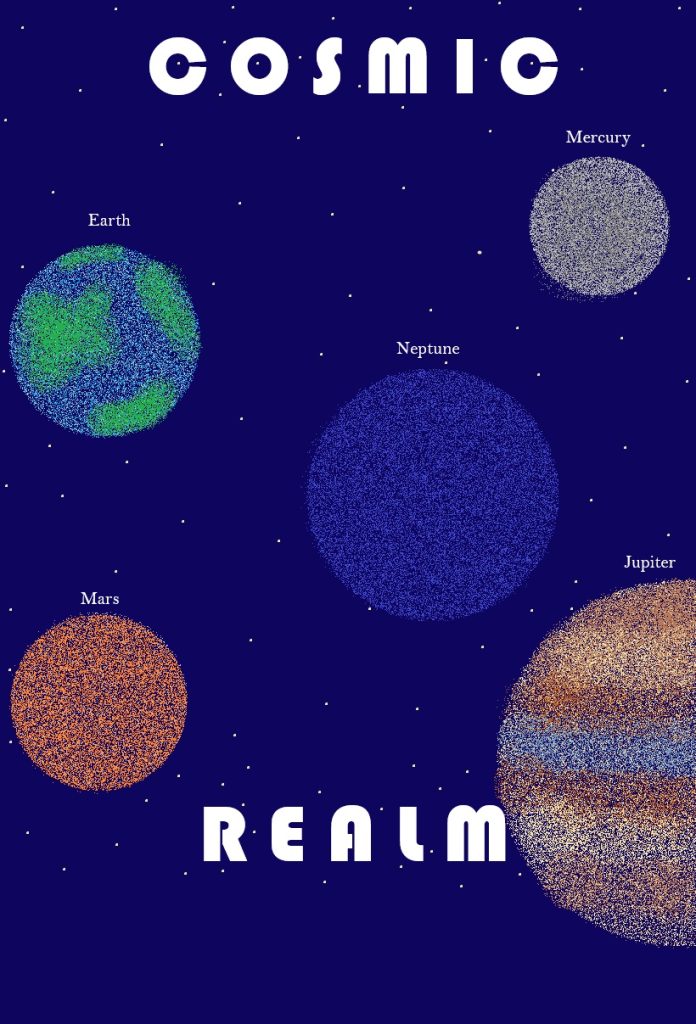
For my second poster I wanted it to be about the planets in the milky way galaxy. I kept the font relatively simple as I wanted to focus more on the planets. I chose to make it white to stand out against the midnight blue background as I want people to know what my brand is called.
For the planets, I chose some of the most popular ones that children may have heard of and created them using the airbrush tool in similar colours to the actual planets as I want them to know that these really are the colours that are in space. I didn’t add any text to this as I think the planets are enough.
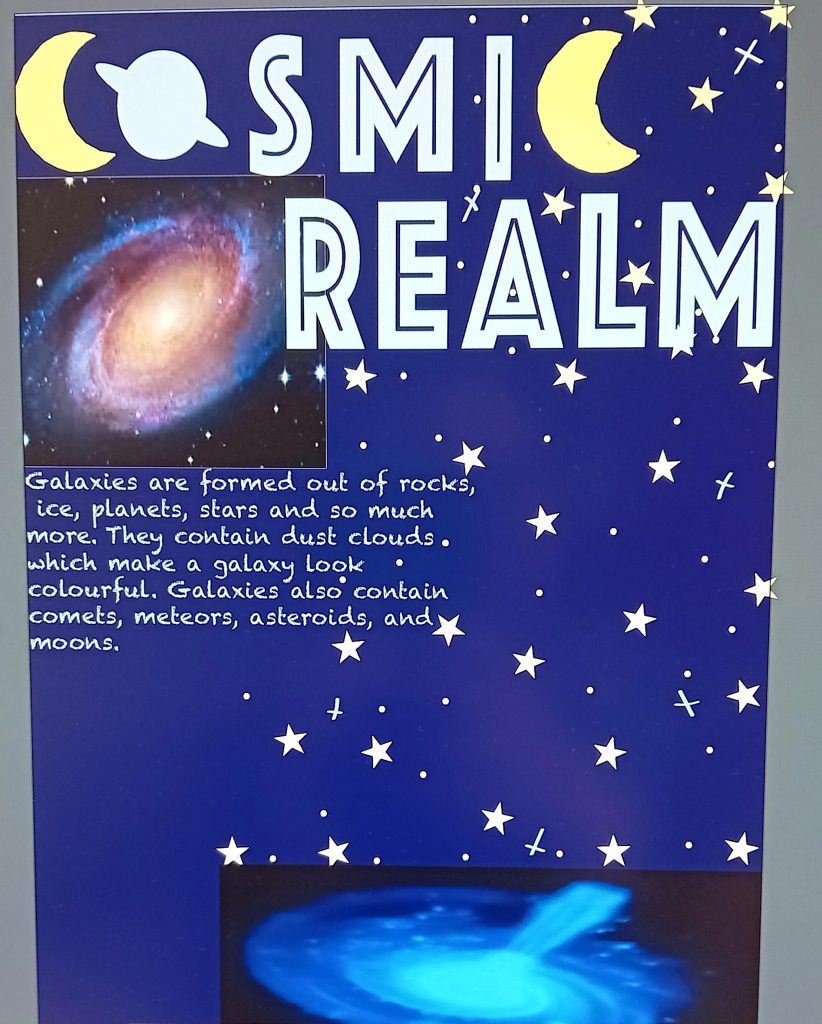
For my last poster, I wanted to focus on galaxies. For the title I wanted to use a really big bold font and that’s exactly what I did because galaxies are huge so I wanted to interpret that. I made both ‘c’s in ‘cosmic’ into crescent moons because it works out well and I wanted a bit of conceptual design in the poster.
I added an image of the milky way galaxy and another galaxy to show that there are many different types of galaxy and that they’re not all the same. I added a small amount of text to let my audience know what galaxies are made up of.
For the background I did a simple design of a dark blue background and some stars because I didn’t want to complicate the poster with a lot of things children don’t even know exist. I didn’t want to add to much as I don’t want them to get confused.