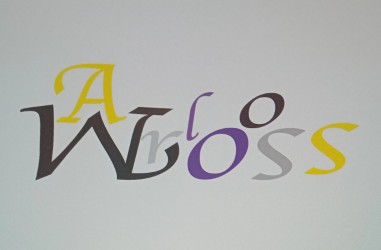
For my first typographical name logo, I decided to flip my last name upside down and make my first name fit nicely on top of it because it looks creative and my first name fits really well like this. I chose the colours of the non-binary flag as that represents what I am, it also works out as there is 4 colours in the flag and 4 letters in my name. I chose the font I did because it makes my name stand out and it looks creative which says something about me.

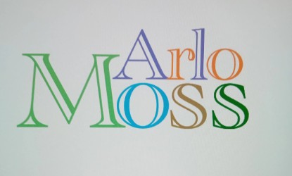
For my second typographical name logo, I chose to make my first name smaller the my last name so that both names fit together. For my first name I chose the colours purple and orange because they are my favourite colours, and for my last name I chose nature themed colours because I love nature. Also with my last name being Moss, it made sense to make it nature themed. I decided on the font I did because it looks cool, it makes my name fit together better, and again, it looks creative. I tried to make this logo represent me in the best way possible, while trying to make the design look simple but effective.