I chose the theme space because I love everything about space and wanted to inform other people, mostly children, about it too as I find it so interesting. The purpose for this was to let people know how beautiful space is and what else you can find other than planets and stars.
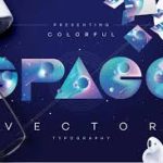
This space logo is an example of what good typography should be because the logo uses letters that represent what it stands for. The letters are made to look like planets. In the logo, you can see a small planet in each letter and the colours used are commonly seen in space. It is also based on a space themed background which makes it more interesting for me to look at.
The colours used for both the background and logo don’t clash which means the logo is easy to read and you are able to see what is in the background clearly. This may interest whoever reads this because the image/logo is pleasing to look at as they both have different styles and colour themes. The logo is also big and bold/capitalised so it catches my eye and interests me into finding out more about space. Its exciting to look at and makes me excited to learn more as there is so much about space that so many people don’t know about.
The font of the logo is interesting because it is completely capitalised, and the letters don’t really look like letters, the letters that are more circular are shaped like planets which I find very cool and interesting. They also show the colours commonly found in space and include small planets and stars inside of the letters which is clever of the creator because it shows what is in space, how beautiful space can be, and what there really is out there.
The spacing between each letter is really close to the next letter which in my opinion, is interesting because it brings the logo together and it makes it look compact. I like this because even though pretty much everything in space is so many light years apart, it shows us what space would look like if everything was close together.
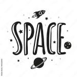
However, this logo is a bad example of typography because there is no colour to it, which causes me to just skip past it and I’m not very interested to find out more. The design is very basic, which shows that not a lot of effort was put into making the logo. Although the logo has a large and bold font, it is not very pleasing to look at so therefore it does not interest me in any way.
The logo does not represent what it is, apart from a few small images of what you normally see in space. The letters are spaces quite far apart which does not make the logo look good at all. It does not really fit with the theme the creator was going for. With this logo, I definitely wouldn’t be interested in learning more about space.
However, using paint, I re-made the logo so it is actually more interesting and better to look at. I added colour to make the image stand out more, and moved the small images around (and coloured them in) to make the image look more aesthetically pleasing. I did this because the original example doesn’t make me want to learn about space as it is a black and white image with hardly any detail. It is a very simple design that I just don’t find interesting. The lack of detail in the original image doesn’t show what the creator intended.
Although I didn’t add any other details to the image, adding colour just changes the perspective of the image and makes it more interesting and makes me want to learn about what there is out in outer space.
I kept the font the same as in the original logo because its big, bold, and stands out, which makes me think that outer space is big and exciting.