
This is a good example of conceptual design because the ‘0’ in “2019” has been replaced with a rising sun/moon coming over a planet on a background of stars in the distance. This is a good example because it is a simple design, you can clearly see what the creator wanted to do, and the design has been executed perfectly to line up with the rest of the image.
This would make me want to learn more about space because the sun coming up over the planet looks interesting as they both are glowing with light. Both concepts of the design in the image go well together and the image might contain something someone hasn’t seen before, such as the planet or how the sun actually glows.
How far the numbers are spaced apart gives us an idea about how far everything in space is apart, which I find interesting because not many people know how far planets/stars/galaxies are away from each other. Some are millions of light years away from each other.
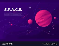
However, this is a bad example of conceptual design because is doesn’t show anything else other than the word “space” and some planets/stars. This doesn’t interest me as there is no meaning to this image whatsoever.
Because there is no meaning in the image, I would just move on rather than wanting to learn about space. The image is boring, the design is very basic and just doesn’t gain my interest. The image is also very dark so you can’t really see anything going on, if there was anything going on.
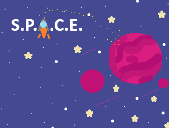
Using Microsoft paint, I re-created the bad example to make it more intriguing and to give the image a meaning. I changed the “A” in “space” to a rocket ship and made a trail of stars in the shape of an arrow leading to the big planet to show the journey the rocket would have been on. This interests me to learning about space because conceptually, the image is exciting to look at, and there is quite a lot going on.
I kept the colour palette as similar as I could (except I made the colours brighter) as in the original image because the colours go well together and again, the chosen colours are space themed. I didn’t change much about the actual design as it is a good design, it just has nothing to show/has no meaning. I added a few stars to the image as these make the image better to look at as there is a bit more detail.