This is my website design of my mobile application. I modified it so it would work with the website by changing the text size, some of the layout and changing the size of images/logos that I had included. I had to ensure it would work correctly so I ran the prototype. It worked so I made sure to include all the details that I had in the application to the website. I kept the colour scheme the same, and well as the type of font as to not confuse the user.
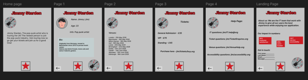
This is my design for a tablet application. Again, I used the same colour scheme and font. I did end up changing the layout of the design a little as I had to ensure it would all fit on the page in a nice way. I moved the logo to the bottom right corner in some of the pages as there was too much information to include as well as trying to get the logo in the same position.
Again, I used a star button on each page to navigate through the pages and a back arrow in case the user wanted to go back through all the pages. As this is a tablet, I used a drag function for each of the buttons so the user could just swipe the button to go to the next page or go back to a page they may have missed.