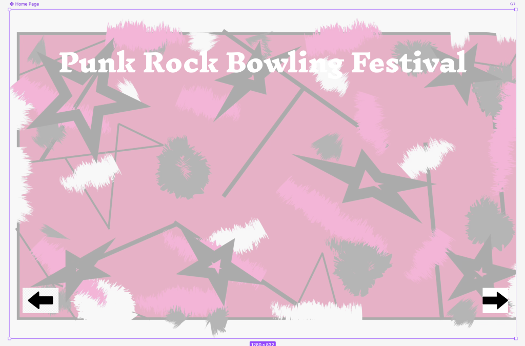
This is my improved homepage of my web page. I improved it by creating the background myself using colours that better matched my festival theme. I kept this simple with just the name of the festival and forward and back buttons to try to draw the viewer in.
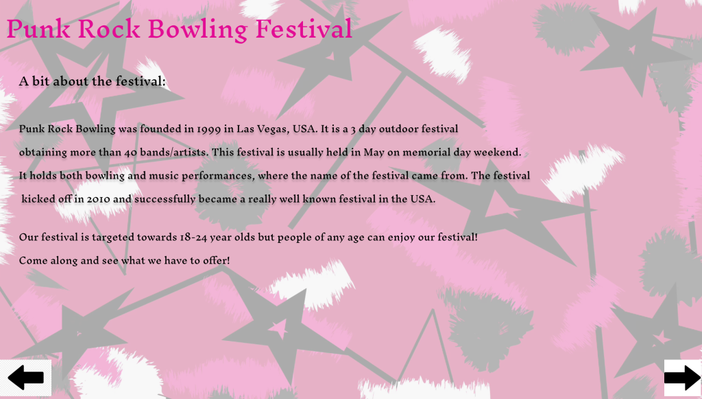
This is the first page of my website. I wanted to inform the viewer a bit about the festival to try and interest them. This has improved since my first one because I added a target audience and added more detail. I also tried to play around with my colour scheme which in my opinion works quite well.
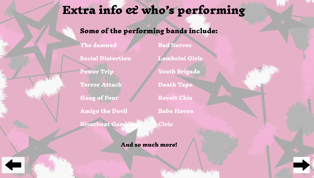
This is my second page of my website. I wanted to let the viewer know what bands/artists they could see if they decided to go to the festival. This has improved from my last page 3 because I didn’t add this in my first website. I again played around with the colour scheme trying to make it appealing to look at and using bright colours to draw the viewer in.
I chose a font that matches a punk rock theme, inknut antiqua. I found that this font works really well with my chosen festival theme
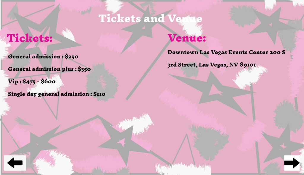
This is my third webpage, I included where the festival is taking place and different ticket types and prices. I kept the font the same as the rest of the webpages and yet again played around with the colour scheme. I think the placement of the text looks really good and works well. It’s clear to see and stands out.
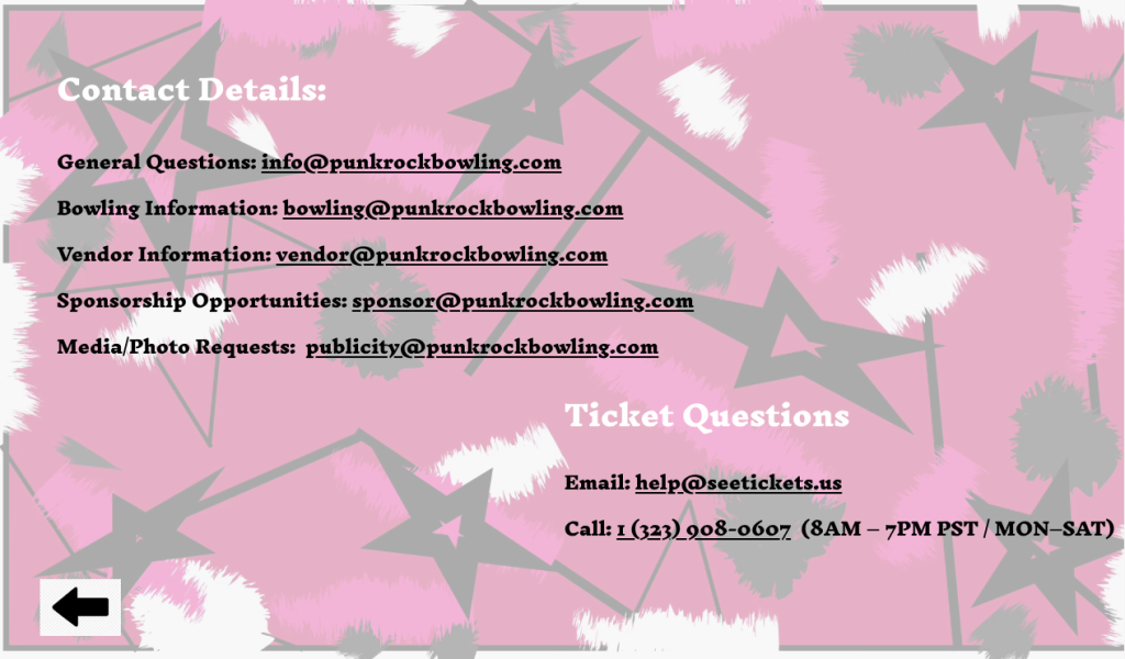
For my fourth webpage, I put contact details and links to everything someone might have a question about. This has improved from the first website design as I didn’t add as many links as I have here, the colour scheme works better and the layout works really well.
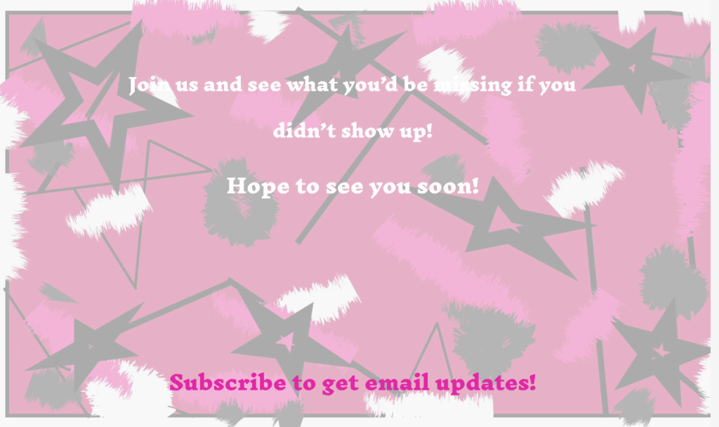
This is my landing page. I kept both the typography and colour scheme the same as the rest of the website as to be sure it doesn’t look misplaced.
My Figma website board – https://www.figma.com/design/oYJbaK39YqVsnNN5DDgJFp/Punk-Rock-Bowling-Festival?t=kCZD5IjmfG7UmGie-0