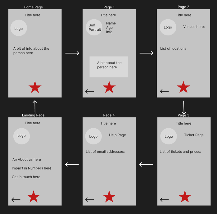
This is my system map of user flow and wireframe UI. I made 6 pages including a landing page. My colour scheme was red, grey and black because these worked best with my theme and I chose a basic readable font to make it easy for the user to read and understand. I included a back button for the user to go back through the pages if they choose to, and I included a star button that makes the current page go to the next page. I made both these buttons quite big to help people who have accessibility needs.
For my layout, I didn’t want to have text everywhere or images in places that doesn’t looks good so I spent a long time figuring out where each text box and image should go. In the end, this is what I came up with. I didn’t want to confuse the user to I made sure to make the layout basic but effective. I included the logo on every page except on page 1 because I wanted an image of my artist to be included and using both on one page didn’t work out.
I developed my system map by creating 6 rectangles and filling them in with the most important information. I added arrows in between each page to let the user know which page was supposed to be next. I included every button, the logo, and the title on every page as this was in my final mobile application design. I wanted my system map to look really similar to my final design as I really liked the design I went with.