My website design – Punk Rock Bowling Festival 1.1 – Figma
My mobile companion app – Untitled – Figma
I made a paper prototype for my website to ensure that all the information I wanted to include would fit on each of the pages, and to see how the actual website would turn out. It also gave me some ideas on how to change my current prototype.
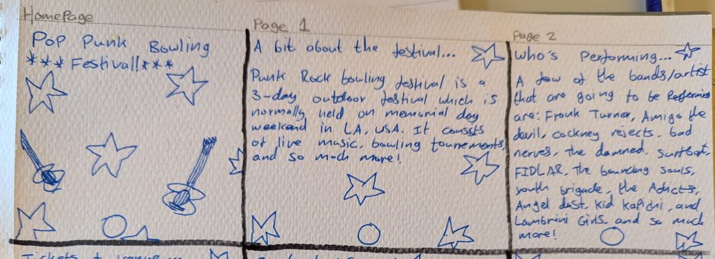
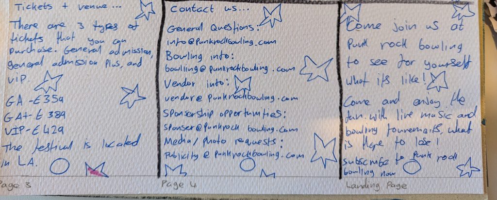
I feel like I’ve organised the type of content I’ve used give my stakeholders a good overview as I’ve given each subject a separate page with a clear navigation system.
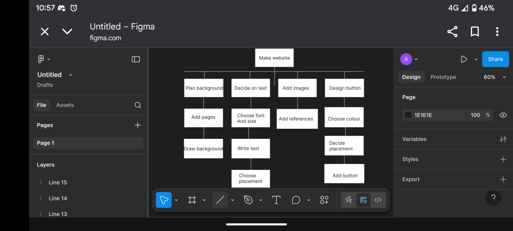
I mapped out my own HTA for my festival to add more clarity for my website design. I started with making the actual website, then moved on to making 4 columns of each of the topics I needed that were on my website. The background, text, images, and the buttons. This would also look the same with my mobile companion app, with just changing the “make website” to “make companion mobile app”.
I also didn’t want to go overboard with the design on my website and companion app as I wanted the users with accessibility needs to be able to use it on their own. I wanted to also ensure that my website and mobile companion app looked mostly professional to the users.