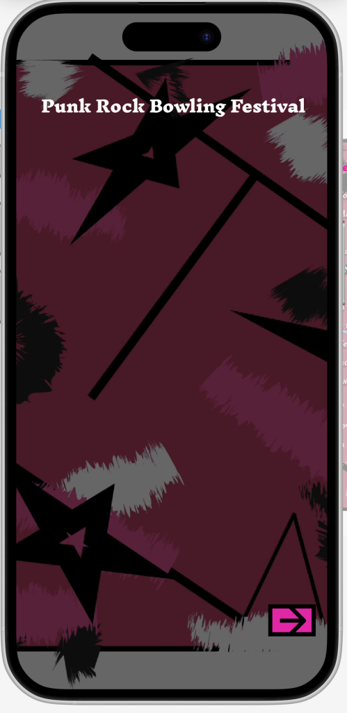
This is my home page of the companion app, I kept it the same as the homepage on my website as to not confuse the user. I played around with the colour scheme until I found shades of colours that work well together with the background, making sure they wouldn’t clash. I decided to keep the font the same as the font on the website as it’s a really good font for my festival choice and pulls everything together really well. The only thing I changed was the forward button, I made it hot pink to make sure it didn’t clash with the background and it makes it clearer for the user to see.
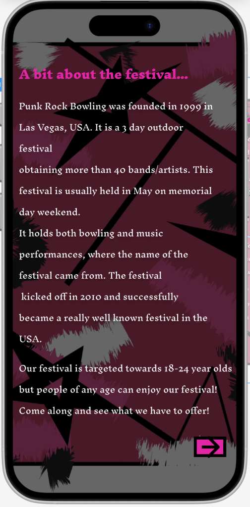
For the next page, I wanted to inform the user a bit about the festival as they’ve probably not heard about it before. I again kept this as close to the website page as possible, just changing the colour of the text to white as it shows up better on the darker background and again changed the button to match the button on the homepage of my companion app.
I included the festivals’ target audience as a guide on what the user is to expect. Even though anyone can go to the festival I thought id included so the user knows what they are getting into if they decide on going to the festival.
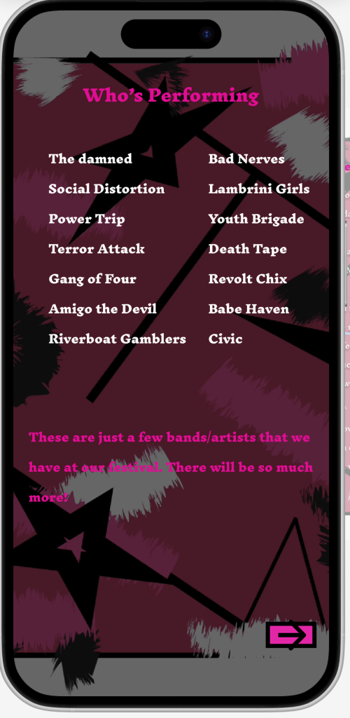
On the next page, I provided a list of some of the artists/bands that will be performing at this festival. I did this to try lure the user in as they may recognise a band/artist they like/heard of. I again kept the colour scheme and font the same as the website, just changing the colour of some of the text to make it stand out.
On the next page I put the venue and different types of tickets that are available and how much they cost. I feel like that was necessary as the user would want to know where the venue is located and what kinds of tickets there are. I kept the font and colour scheme as similar as possible to the website as to not confuse the user about why there are two different versions of the same concept.
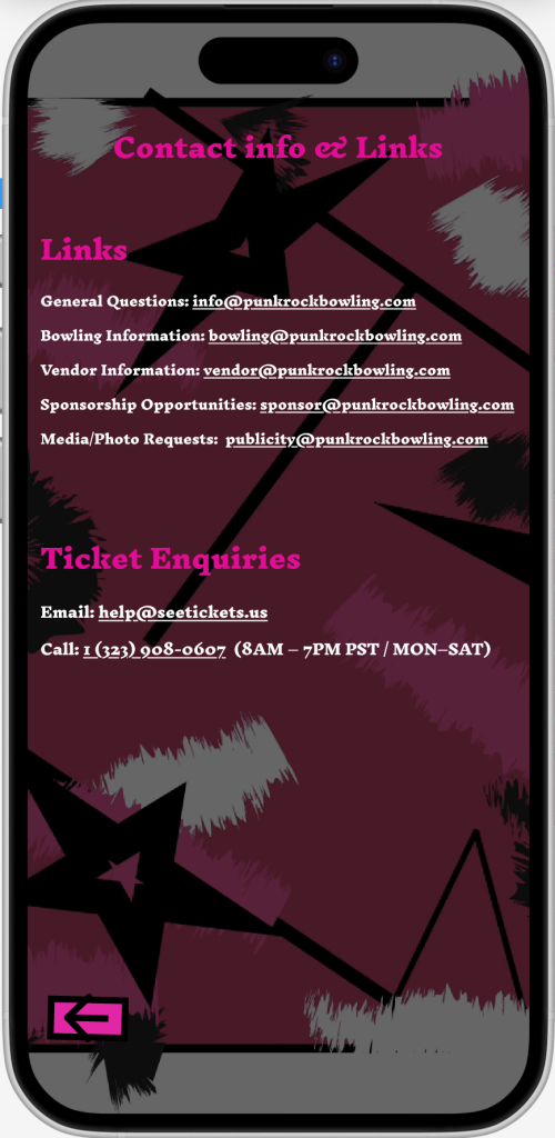
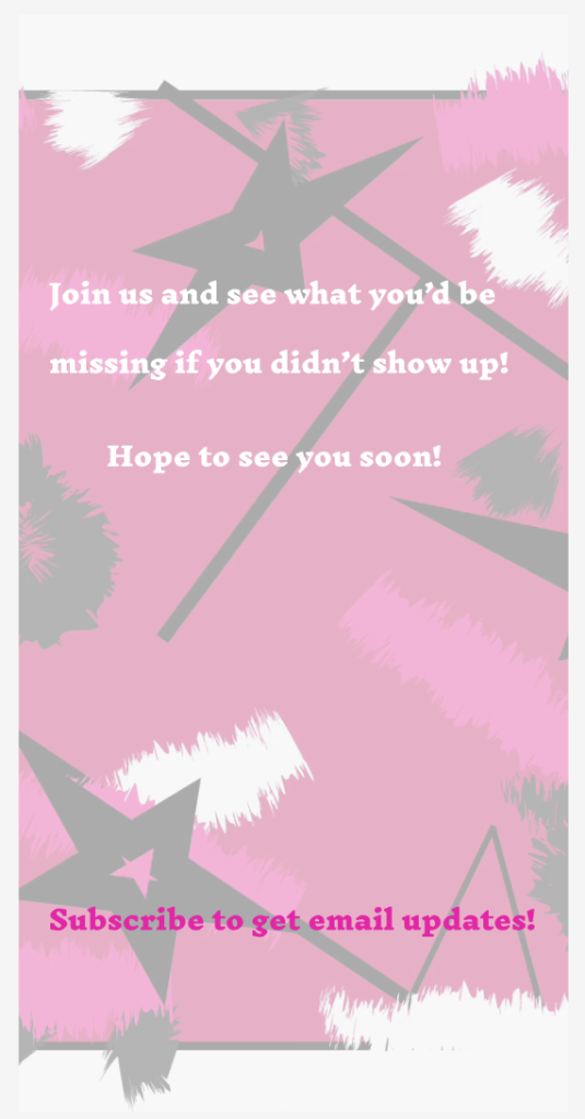
For my last page I put useful links and some contact details so the user can ask someone about tickets and find out some useful information if they needed to. I feel like these would be important to have on a mobile application, especially about a festival.
This is my landing page, I made sure to keep it simple so it wouldn’t lose interest of the user. I made sure to keep the colour scheme and typography the same as the rest of the app so it wouldn’t look misplaced.
My mobile app figma board – https://www.figma.com/design/eo3urU3O5C8gUGpY4fyoEG/Untitled?t=EfLgHMRJGnsMDvl7-0